Chart types are visual representations of historical price data used in technical analysis to analyze and understand the price movements of financial instruments, such as stocks, in the stock market. Each chart type has its unique characteristics, and traders use them to identify patterns, trends, and potential trading opportunities.
The three main types of charts used in the stock market are candlestick charts, line charts, and bar charts.
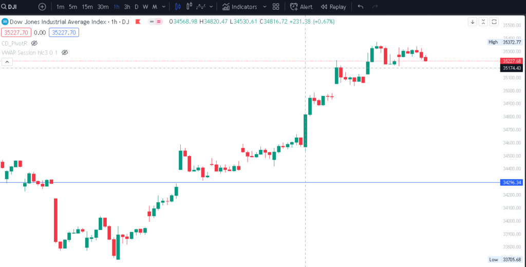
Candlestick Charts:

- Candlestick charts are one of the most popular chart types in technical analysis due to their visual clarity and ability to convey a wealth of information.
- Each candlestick represents the price movement of a specific time period (e.g., 1 minute, 1 hour, 1 day).
- The body of the candlestick represents the price range between the opening and closing prices during that time period. If the closing price is higher than the opening price, the candlestick is typically colored green or white, indicating a bullish (upward) movement. If the closing price is lower than the opening price, the candlestick is colored red or black, indicating a bearish (downward) movement.
- The thin lines extending from the top and bottom of the candlestick, known as wicks or shadows, represent the highest and lowest prices reached during that time period.
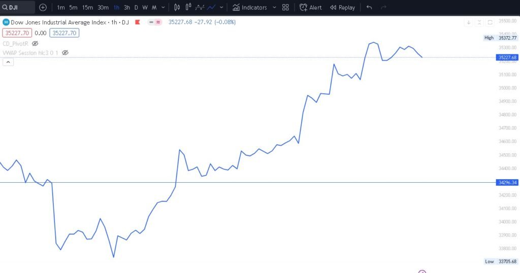
Line Charts:

- Line charts are the simplest type of chart and are created by connecting the closing prices of a financial instrument over a specific time period.
- Each data point on the chart represents the closing price for that particular period, and a line is drawn connecting these data points.
- Line charts provide a clear view of the overall trend but may lack the detail and information found in candlestick or bar charts.
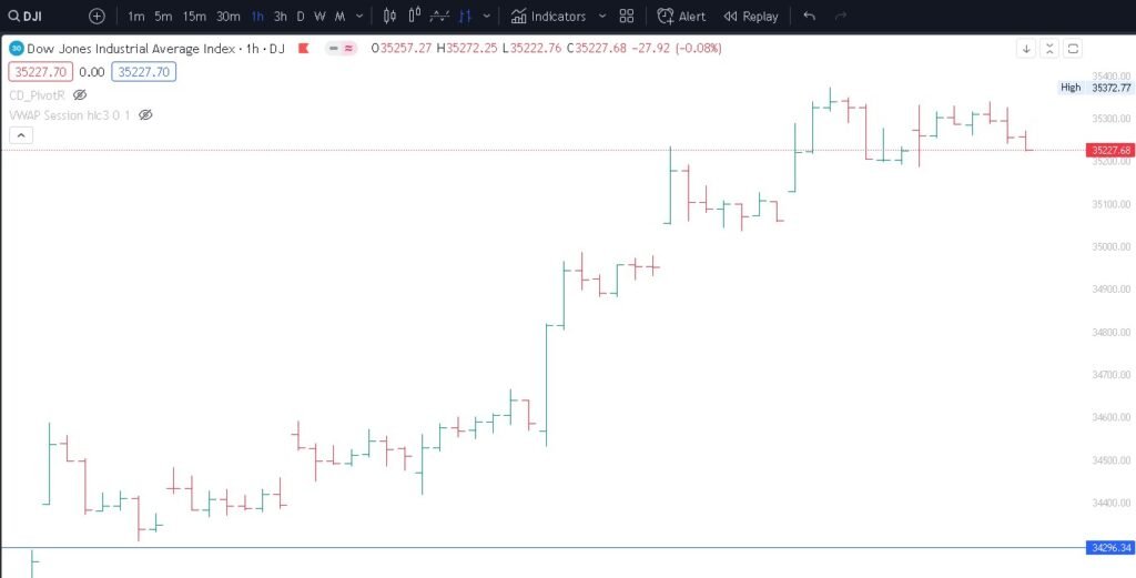
Bar Charts:

- Bar charts display price movements in a more comprehensive way compared to line charts.
- Each bar represents the price range between the high and low prices during a specific time period.
- A vertical line extending from the top of the bar represents the highest price reached during that period, and a vertical line extending from the bottom of the bar represents the lowest price.
- A horizontal line on the left side of the bar represents the opening price, and a horizontal line on the right side represents the closing price.
- Bar charts provide information on the overall price range and the relationship between opening and closing prices for each period.
Each chart type has its advantages and limitations. Candlestick charts are widely used for their ability to provide more detailed insights into price movements and trends, while line charts offer a clear view of overall trends. Bar charts combine both aspects, providing a balance between detail and simplicity. Traders often choose the chart type that best suits their trading style and preferences for analyzing stock market data.